Do you want the brand new YouTube Design? - Here we go!
YouTube redesign with Google+ integration, overhauled UI, and social focus rolling out
If you want the new YouTube layout before it's rolled out officially you just have to follow this 4 simple steps:
2. Press Ctrl + Shift and J in Chrome to open the Developer Tools
Press Ctrl+Shift+K in Firefox
3. Click on the "Console" Tab and enter
document.cookie="VISITOR_INFO1_LIVE=ST1Ti53r4fU";
4. Reload the website and enjoy the new layout.
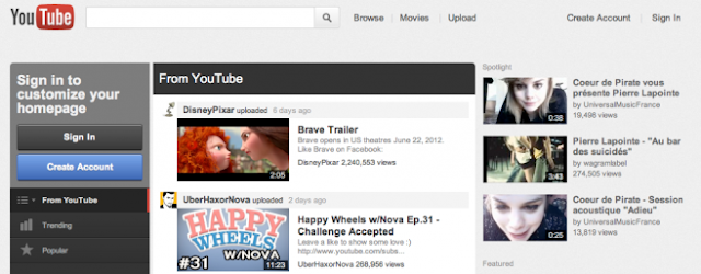
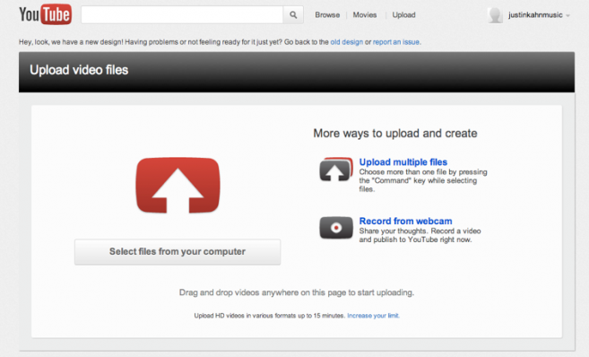
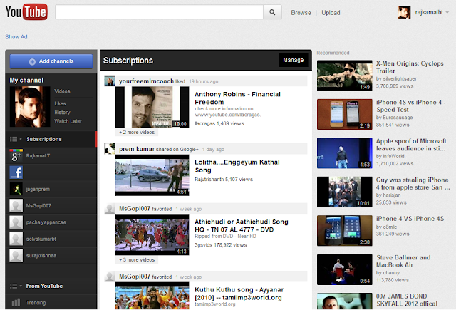
There have been rumors that Google is testing a new redesign for YouTube. While we’re not sure if it’s rolling out to everyone today, we’re starting to get reports from Canada and elsewhere that the redesign is live. As you can see from the screenshots above and below, these are some quite significant changes including a new customized homepage that is essentially a news feed of trending content and your subscriptions and channels. A new sidebar on the left lets you manage and track all of your subscriptions, channels, and trending content, while Google+ integration lets you view and filter content recommended by people in your Circles.
You’ll also notice the new gray background, while the YouTube logo in the upper left now takes you to YouTube.com/guide. In the image below you can see new resizing UI gives three buttons, one for your normal view,the second for an expanded widescreen view, and the third for full-screen. The rest of the site obviously gets a redesign in line with everything you see on the homepage. The screenshots below pretty much speak for themselves.
YouTube has also begun adding support for 1080p playback, native full-screen mode, annotations and captioning to the HTML5 video player (via Electronista). More screenshots after the break showing the full redesign.


No comments:
Post a Comment